Building Intuition for Persistent Homology
In this post, I want to explore persistent homology and some intuition surrounding it without leaning too hard on formalism.
The problem: data has shape
Imagine you sample a hundred points from a circle. There is no oracle that says “this came from a circle”. Instead you just have a list of \((x, y)\) coordinates. But the shape is there, latent in the point cloud. If you could detect it, you’d know the data lives on a loop, not a blob.
Now imagine the same number of points sampled from two separate clusters, or from a torus. The statistics of the datasets are different (e.g. mean, variance, pairwise distances), but the topological fingerprint changes too, and often more clearly. Persistent homology is a way to read that topological fingerprint and analyze the implications of it on your dataset.
The Filtration
The key idea is surprisingly simple. Put a ball of radius \(r\) around each point. Start with \(r = 0\) (so that each point is isolated) and slowly increase \(r\).
As \(r\) grows, two things happen:
- Balls overlap. When two balls first touch, we draw an edge between the corresponding points.
- Edges form triangles. When three points are all mutually connected, we fill in a triangle.
This growing process is called the Vietoris-Rips filtration. At each value of \(r\), we have a combinatorial object (a simplicial complex) that approximates the shape of the data at that scale.
By topological features, we mean connected components, loops, voids, and higher dimensional analogues. As \(r\) increases, these features can appear and disappear. A connected component is born when a point first appears (always at \(r = 0\)) and dies when it merges with another component. A loop is born when a ring of edges closes up, and dies when the interior fills with triangles.
Persistence diagrams
For each feature we record two numbers: the radius at which it was born and the radius at which it died. Plot birth on the \(x\)-axis, death on the \(y\)-axis. Altogether, these form a persistence diagram.
Every point lies above the diagonal, since death always follows birth. Note though that due to computational artifacts, some software packages may produce points on the diagonal and these should be ignored. The vertical distance from the diagonal is called persistence and is a measure of the scale over which a feature survives.
It is tempting to read long-lived features as “signal” and short-lived ones as “noise.” This is often done in many tutorials on persistence, and there are lots of example cases in which this is true. This framing might even come from the stability theorem, which guarantees that small perturbations to the data move points in the diagram by at most the same amount. But stability and significance are different things. Short-lived features are stable to small perturbations; they simply live at a finer scale. In the circle-of-circles example discussed below, the small loops inside each cluster die quickly, yet they are exactly what distinguishes that dataset from a plain circle.
Perhaps a better reading is that the diagram gives you the full multi-scale topology of the data. Which features are relevant depends on the scale your application cares about.
Try it out
The best way to build intuition is to interact with the filtration directly. The Persistent Homology Explorer tool allows you to mess around with persistence for a variety of small toy datasets. You can pick a datapoint set, drag the radius slider, and watch how features appear in the diagram as \(r\) grows.
A few things worth trying:
- Circle: Start at \(r = 0\) and increase slowly. Watch the \(H_1\) point (a loop) appear and persist. That persistent loop is the circle.
- Two clusters: You’ll see two H₀ components born early, and then one dying when the clusters merge. The gap between birth and death tells you how far apart the clusters were.
- Noisy circle vs. annulus: Compare the \(H_1\) signal in both. The annulus has a stronger, more persistent loop because the gap is more pronounced.
- Figure-eight: Two loops appear in \(H_1\), then one dies when the shared region fills in. A figure-eight has the topology of a wedge of two circles.
As you go through these examples, click on the various Cech and Vietoris-Rips labels on the legend. See if you can localize or identify where in the data each feature is coming from.
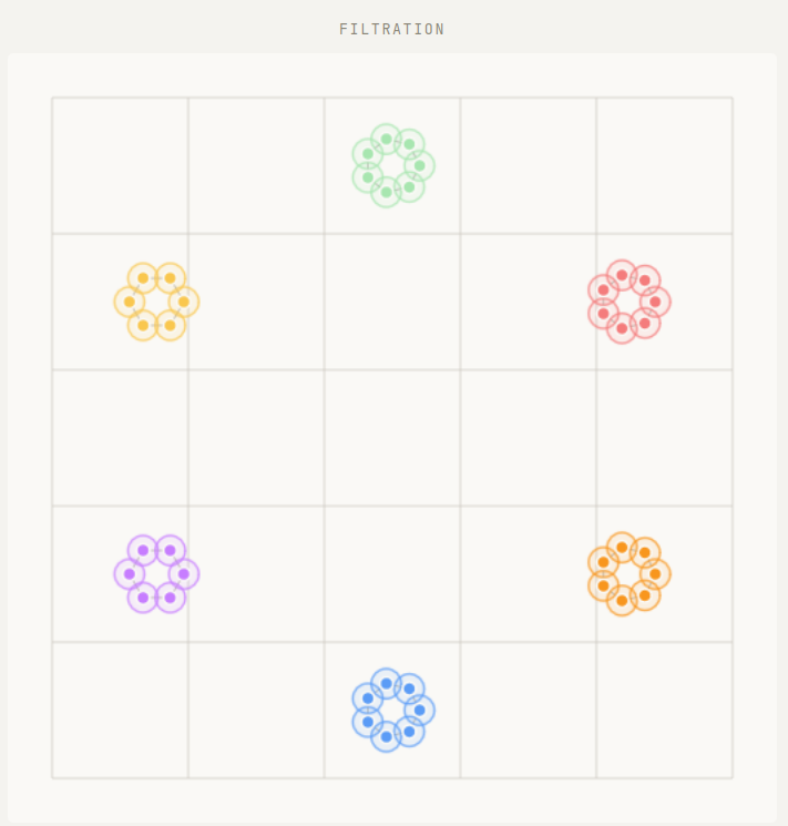
Circle of circles
One of the best features of persistent homology is its multiscale nature. Varying the radius \(r\) allows us to study several scales simultaneously without any practitioner input.
Take for example a circle of circles. Imagine six circles arranged at the even hours on the face of a clock.

What is the shape of this data? If you were “zoomed in”, you might only see the individual points but not their arrangement into circles. As you zoom out, you would start to see the 6 individual circles but still not their global arrangement into yet another circle. Finally as you zoom out more, the 6 individual circles might start to become difficult to make out, but you would definitely now start to see the global arrangement of a circle. Finally, as you zoom even farther out, you would see just a single lump of points.
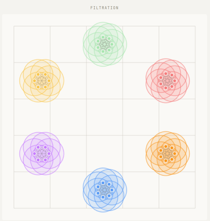
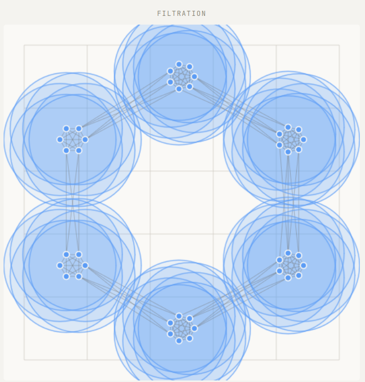
Persistent homology is what makes this kind of “zooming out” analysis precise. All of the above information can be read off from the persistence diagram in a rigorous fashion.
Vietoris–Rips and Čech
The explorer shows two filtrations side by side: Vietoris–Rips and Čech. Both grow from the same point cloud but differ in when triangles are added.
- In Rips, a triangle is filled when the longest edge reaches \(2r\) — it’s purely combinatorial and fast to compute.
- In Čech, a triangle is filled when the three balls have a common intersection — geometrically precise but more expensive.
Čech is theoretically tighter (it’s guaranteed to recover the correct topology by the nerve theorem), but Rips is close enough in practice and scales much better. For most applications, Rips is the right default.
What the diagram is really saying
The persistence diagram is not just a scatter plot. It is a coordinate-free, multi-scale summary of shape. The stability theorem guarantees that small perturbations to the point cloud move points in the diagram by at most the same amount. This should be interpreted as saying the diagram is robust to noise in the data, an essential property for any real data science algorithm. But robustness is not the same as interpretability. The diagram records topology at every scale simultaneously, and which features matter depends on the question you are asking. Two point clouds sampled from the same geometric object will tend to produce similar diagrams, which is what makes them useful as features in downstream ML tasks. The utility here comes from the full multi-scale picture, not from filtering it or thresholding it arbitrarily down to the longest lived features.